Tuesday, 23 February 2016

Box Construction


As part of another creative task, we were asked to create a wearable head from a cardboard box. I have detailed both my step-by-step drawings of the construction project (left), as well as the photos I took during production.

Unfortunately, I was not able to get a clear photo of the finished head, but it should be clear how the final head looks from the following Nonsense Sequence project that led on from this.


...

Tuesday, 2 February 2016

Facial Expression Drawings

Continuing with life drawing, we chose to draw various facial expressions with partners - ranging from subtle to extreme. The medium used was pencil, then later fineliner with promarker to add tone. The results of this session are below.


----------------------------------------------------------------------------

Wednesday, 27 January 2016

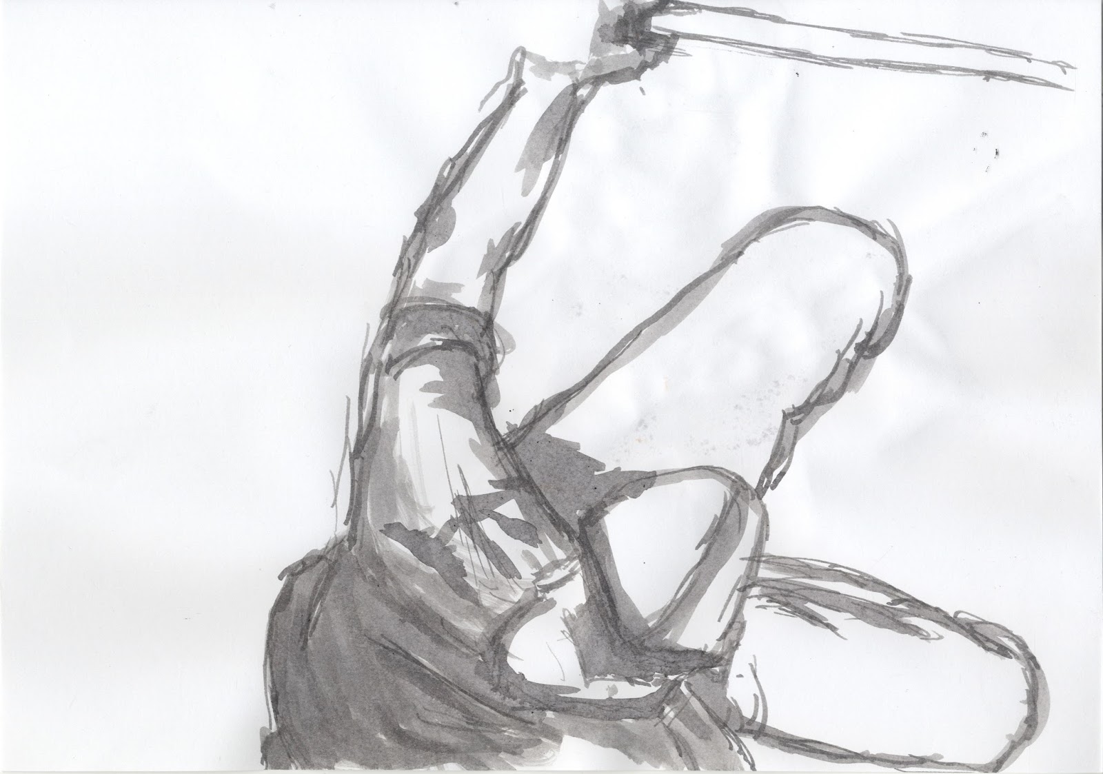
Ink Figure Drawings

In a return to life drawing, we chose to draw narrative figure poses as one-off stills. The medium used was ink, which allows a varying mid-tone when diluted. The results of this session are below.


----------------------------------------------------------------------------

Monday, 25 January 2016

First Story Ideas

In response to a live brief to design children's book covers, I have illustrated my ideas for two of the four available topics. The following will present my designs and the ideas behind them for the 'FIRST STORY' school poetry brief.


FIRST STORY - My Voice is a Shy Tiger


My idea for 'My Voice is a Shy Tiger' consists of two characters (a child and a tiger) made out of blocks. Because both are created from the same shapes, it represents that the tiger is a part of the child (their voice). While the child has simple features which make them easier to connect with the reader, the tiger has a detailed yet innocent face. I have chosen to make the child gender-ambiguous, so that any child could project themselves onto them and relate to their experiences. They were purposefully designed without a mouth - showing that they have literally lost their voice. For the covers themselves, I showed the tiger walking away from the child on the front cover, with the child and tiger reunited on the back cover. I used bright colours to design my characters, so that they would stand out against the darker blue of the covers. On both covers, I have provided spaces for a scratchy, black title and the blurb.


FIRST STORY - Journeys


My idea for 'Journeys' involves a child writing, and those stories representing journeys through her imagination - to the past, future, and other places. The girl's imagination takes up the top half of the front cover's design - signifying the importance of these journeys (shown like a branching path). The back cover shows the girl's stories after she has finished writing. My intention was to use a lot of white and orange, as they bring a warmth and purity to the composition. The imagined journeys were designed with bright colours as to make sure they don't overpower the path connecting them to the child. On both covers, I have again provided spaces for a title and blurb.


--------------------------------------------------------------------------------------------------------------

Wednesday, 30 December 2015

Me Drawings

Another of the briefs was to practice drawing children by using ourselves as reference. Therefore, I have drawn heads, proportions and extremities from photos of my younger self to better achieve the task. It is difficult for me to draw without thinking of the detail first, so proportions were challenging to draw. I believe the hands and feet studies are the most correctly proportionate drawings.


I sketched from old photos using pencil. I have not omitted any drawings and have scanned them in the best quality I could, though some of the linework is difficult to interpret.

Nonsense Sequence

One of our briefs was to make a nonsense sequence, including the cardboard box masks we had previously made. The meaning of this task was to get us to not fall into the trap of conventional visual storytelling. By constructing a sequence from random elements and poses, it is possible to create something unique.


I created my sequence so that it was not restrained by panels, adding to the randomness of it. It was coloured with pencils in a non-selective way. By mixing unusual colours with these elements, I can further emphasise nonsense. The story of the sequence follows a knight who slays a dragon in a business suit; a spirit of creatures then appears before the knight. 

Friday, 20 November 2015

Forest Sequence


This task challenged me to produce a figure sequence (of 3-5 frames), using different viewpoints. The finished sequence shows a cloaked traveller walking through a snowy forest. In this sequence, I incorporated perspective to achieve appropriate depth of field, and managed to use three different viewpoints.
The base version of the sequence was drawn with pencil, prior to thickening the lines with pen. I changed the completely dark sections to a dark blue colour - through the use of an image manipulation program (GIMP). This was done so that I could not have any black sections when adding colour in different mediums.
Next, I worked on a pencil colour version of the sequence. By limiting my colour options to only three colours, I tried to achieve a warmth emanating from the setting sun, throughout the sequence. By contrast, I wanted to make the tree trunks and forest floor feel cold to the viewer. As you can see, the use of the aforementioned dark blue sections works to demonstrate the size and density of the forest. 
The following version of this sequence is monochromatic, and gives a completely different atmosphere to the colour version. The ambiguousness of the elements used in the base sequence allowed me to change the time of day, and add long shadows to demonstrate the strength and direction of light. I think the negative space provided by the foliage and snowy ground balances well against my use of heavy black sections in the sequence.