Tuesday, 19 April 2016

Watercolour studies

In my own work, one of the areas of particular interest was experimenting with watercolours. As I work mainly in black-and-white, I needed to introduce colours that were quick to apply and enjoyable to use. Below I have produced a sequence of studies, with reference to the Pokemon series, which shows one of the evolutionary lines present in the titular creatures.

I was inspired by the original Pokemon drawings by Ken Sugimori (1), so I decided to emulate his style, while recreating the modern versions of these three creatures. The blend creates a nice balance between paying homage to the original coloured designs, and recreating the modern versions. Below is the aforementioned evolutionary line, with and without the defining ink lines.
Caterpie - watercolour paint


Caterpie - watercolour paint + ink
Metapod - watercolour paint

Metapod - watercolour paint + ink

Butterfree - watercolour paint


Butterfree - watercolour paint + ink


---------------------------------------------------------------------------------

(1) Archives.bulbagarden.net (n.d.). Category: Ken Sugimori Pokemon artwork - Bulbagarden Archives. [online] Available at http://archives.bulbagarden.net/wiki/Category:Ken_Sugimori_Pok%C3%A9mon_artwork [Accessed 18 Apr. 2016].


FMP Research task

It is important for me to know which themes and ideas are most relevant in my work, that I can recognise and explore in preparation for my Final Major Project next year. The task was to record visual research pertaining to these themes, and incorporate these references in a way to produce an illustration of some kind.


As the themes of my FMP are humanity, working together towards a common goal, and overcoming obstacles (adaptability), I started with initial figure observations and later made a sequence of illustrations using these references. The thumbnails tell a story. Workers see that a couple are walking along an unfinished path, so they work together to complete the path, while the couple remain undisturbed.


  • At this point, I had the basic information I needed to construct elements of the sequence.
  • More reference for figures in motion / walking was needed, as well as potential reference to details of anatomy, clothing and facial features.
  • All three themes of my FMP were successfully presented through these initial thumbnails.


Through my second observation of new figure references, I managed to visually record more that could assist me with improving the sequence. Also can be seen above are two of my original thumbnails, better represented using information from the new references. Even from these, improvements can be seen, and it would not be hard to imagine what the finished sequence would look like.


  • I managed to record people in motion from different angles.
  • Basic anatomy of the figure was captured.
  • New references were substantial to refine my sequence further.
  • If research was to be continued, more facial + clothing detail would be required.


----------------------------------------------------------------------------------------

Advanced Drawing & Authorial Practice Module Evaluation

In reflection of the Advanced Drawing section of this module, I have made a major improvement in my drawing skills, both from first-hand observation and reference. One particular part of the module I am pleased with is my final project, which helped me to focus on what I wanted to illustrate, and in what ways, in my future artistic career. This is turn helped me begin to define what kind of illustrator I am. Within this module however, I am disappointed that I did not get the opportunity to explore and develop further the tasks we were given. Also, I recognised a lack of colour and medium exploration in my Advanced Drawing work, an issue which I am attempting to resolve.

In reflection of the Authorial Practice section of this module, I feel that I have significantly expanded the range of colour and mediums that I use in my work. I am pleased that I have been able to undertake self-initiated illustration projects - helping me to keep focused and produce work on a regular basis. Despite these positives, I have had a similar problem with a lack of development in my authorial work, as I have put a minimal focus on that side of the module - with Advanced Drawing deeming itself the priority.


Overall, I have seen positive improvement with my drawing skills and use of colour and foreign mediums in my authorial work. On the other hand, there is a lack of exploration and development as evidenced in both parts of this module.

Monday, 18 April 2016

Biro pen drawings

The following are examples of biro pen drawings I have created in the past few months from reference. They differ in tone and origin, but I endeavoured to keep the same graphic style throughout all of them. I feel that the most effective example is the drawing of Smaug the dragon (The Hobbit: The Battle of The Five Armies), which demonstrates good shading, tonal blending, and balance against the lighter background.

Orbital Drop Shock Trooper - HALO (1)

Smaug destroying Laketown - The Hobbit (2)

Spiderman - Civil War (3)


---------------------------------------------------------------------------------

(1) ODST concept art - HALO series. (n.d.). [image] Available at: https://s-media-cache-ak0.pinimg.com/736x/9c/9c/b5/9c9cb5ad8d4869c5986dc9022964f703.jpg [Accessed 18 Apr. 2016].

(2) The Hobbit: The Battle of The Five Armies. (2014). [film] Peter Jackson.

(3) Captain America: Civil War. (2016). [film] Marvel Studios.


Stabilo pen drawings

In the pursuit of trying to find different colour mediums to illustrate with, I ended up using Stabilo coloured pens for the first time in my own work. Once again, I chose to take reference from Pokemon - this time recreating the three Kanto legendary birds (each with their own colour). When drawing these birds, I always tried to keep a good balance between the chosen colour and the negative white. I enjoyed using these pens, as the flow of ink and vibrancy of the colours allowed to draw circular lines with ease, as well as vary the line weight.

Articuno

Articuno is originally blue so I used a dark blue pen. (1) While I used some of the shading from reference, it was difficult to keep a balance between the white and blue while keeping it looking realistic. The bird is almost entirely made up of curves so this is a good example of the control I had while drawing the lines.

Zapdos

Zapdos is originally yellow, but I thought the vibrancy of the yellow Stabilo would be too much, so opted for an orange pen instead. (2) I used almost all of the shading from reference as the blocks of heavy colour, except for where the wings join the body - in another attempt to balance the colour with the space. This bird is almost entirely made up of straight lines, which was more difficult to accurately scale down with the pens.

Moltres

Moltres is originally orange with red flames; as it is akin to a phoenix, I selected a red pen to better merge the flamed wings and tail with its body. (3) The reference has a clear distinction between red and white sections of flame, which was brought across to this drawing. This is my favourite of the three bird illustrations because of the achieved colour balance, accurate scale of the form, and the flowing detail of the flames.


Kanto Legendary Bird Trio

After creating these illustrations, I arranged them into a single panoramic image, with all three birds complementing each other within the arrangement.


-----------------------------------------------------------------------------


Observational work

A few examples of my own observational work can be seen here. Earlier in the academic year, I went to Pitville Park and illustrated the first two examples, as I wanted to improve my observational skills and my use of watercolour paint. I feel that the bridge drawing, while not completely accurate, has a sense of realism to it. By allowing the lines to be somewhat looser, I managed to capture the structure and detail of the bridge. On the other hand, the watercolour study was not as successful in this regard. This example showed me where I needed to improve with the balance of tone, detail, and water level on the brushes. 

Pitville Bridge - pencil


Pitville Pump Room - watercolour paint


This final example was made more recently and is an observational drawing of one of my pet dogs, as a present for a family member. I am pleased with how I was able to capture the scale and depth of the form. This shows an improvement from where my observational pencil skills were earlier on in the academic year.


----------------------------------------------------------------------------------


Directional Lighting

In experimenting with directional lighting, I made several small studies from observation. The first set of studies were illustrated with a biro pen and observed during the night. The second set were created with a biro pen and enhanced with promarkers, and observed during the day. This is the more successful attempt at portraying light and shadow, with the negative space in the studies being used to great effect as the light. However, I found it difficult to illustrate directional lighting from sources other than natural sunlight - examples of this can be seen in the two light fixtures.

Night - trees, light fixture, van.


Day - window, light fixture


--------------------------------------------------------------------------


Sunday, 17 April 2016

Concept Art - Distant Traveller

For one of my work experience opportunities, I was approached by a friend who was working on a game project of his own, with others. Through a private conversation, I agreed to a commission project to be a concept artist for his independent game company - Feet First Games. The commission involved designing illustrated concepts for a game's logo, as part of its pre-development concept work.

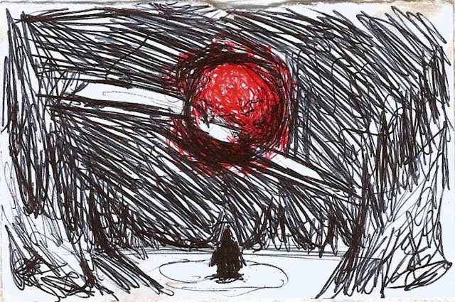
The first thing I focused on when designing the logo was what it was for. I created concepts for the company's sci-fi game - Distant Traveller. An early sketch of the logo (and potential cover design) can be seen below. The premise of the logo was to be an anonymous traveller looking up at a sun in the centre, with a white streak going across it. I drew inspiration from games with similar design aestethics, such as No Man's Sky (1).

Original concept sketch - Distant Traveller

I added to this by making the streak actually pierce the star (which can be seen cracking at the points of impact). The traveller is dwarfed by the surrounding spires and rock formations, indicating geological patterns not native to an Earth-like planet. Early on, the first colour I experimented with for the design was a deep red of the sun, which would be instantly recognizable to someone as a star from a different place in the galaxy than our own.

Next, I cleaned up the sketched lines and produced a digital version of the logo. This version is the finished promotional art. Some changes I made include making the sun bigger, and showing the fragments of the sun breaking off as if it were a solid entity. The landscape has been further structured and shows the light of the sun. I have also added a colour gradient for space and stars to show the presence of other suns in the galaxy.


Final promotional art - Distant Traveller

Working with my friend who commissioned me, I present him these production concepts and continue with them if they are thought to convey his original idea. If any elements need changing, I can do so as it is easy to do so in a digital format.

Although this work experience commission was only for development of the logo, I stayed with the company to work on further pre-development work for Distant Traveller. This commission gave me a taste of development of ideas, working with a project partner, and being able to receive and work around critical feedback for my concepts. This is the largest concept art project for my authorial practice.


Social media banner - Distant Traveller


-------------------------------------------------------------------------------------

(1) No Man's Sky promotional art - Hello Games. (2016). [image] Available at:  http://cdn.akamai.steamstatic.com/steam/apps/275850/header.jpg?t=1457021504 [Accessed 11 Apr. 2016].


Redrawing the Line risograph publication

For one of the last projects, we had to produce an illustration for a risograph publication - 'Redrawing the Line.' This is a women-centric Indian magazine that focuses on issues surrounding the female population. In our illustration, we had to present an issue currently facing the opposite gender. As seen below, I have illustrated a female figure that is covered by various renowned make-up brands - portraying how advertising can lead to a woman's true beauty being covered up, in a literal sense. The logos are arranged on a grid which can also be seen as a cage/cell that women are trapped in by these beauty products.

The two-part separation can be seen here, with the above image to be red, and the bottom image to be black, in the final risograph print. There exists two variations of the black image as the brand logos may not show up the way I want them to if they are the same colour as the background. Leading on from the two-part separation of my illustration is a brief description of my practice and self-portrait - to be featured in the publication also.


I am a mostly traditional illustrator and like working in pencils and watercolours, though I enjoy the freedom of digital drawing. My drawings are mostly black-and-white, but I have introduced more colour over the years. I like to put metaphor in some of my works, as I feel it is important to represent significant themes through art. My art style is usually very detailed and this allows me to capture the weight of an image from reference or real life.


-----------------------------------------------------------------------------------------